The Power of Contrast in Age-Friendly Design
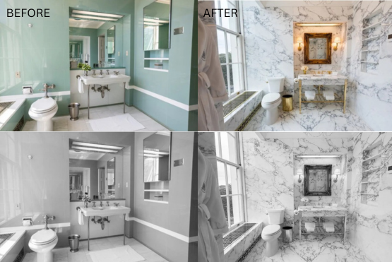
The grayscale comparison in the images above highlights how much contrast was lost in this renovation. The updated bathroom reads as a single tone, making the toilet, sink, and walls harder to distinguish. This can be disorienting and unsafe for people with age-related vision changes. Image source: New York Times
Designing environments for older adults often focuses on features like grab bars, wider doorways, and non-slip flooring. These features matter, but one of the most overlooked aspects of aging-friendly design is visual contrast. Contrast is not a decorative preference. It is a key environmental feature that helps people navigate their surroundings safely and confidently as their vision changes with age.
Whether someone is aging in place or living in a senior living community, strong visual contrast between floors, walls, furniture, and fixtures supports balance, spatial orientation, and independence. Many modern renovations rely on neutral palettes, low-contrast finishes, and monochromatic surfaces that unintentionally make environments harder to navigate.
Healthy aging brings predictable changes to the visual system. According to the American Academy of Ophthalmology, adults often experience reduced contrast sensitivity, greater sensitivity to glare, more difficulty distinguishing similar colors, slower adjustment between bright and dim spaces, a need for more overall light, and reduced depth perception. These changes make it harder to see edges, judge distances, and interpret surfaces.
These visual changes contribute to higher fall rates, particularly when visual boundaries are unclear. When surfaces blend together, people may hesitate while walking, misjudge edges, or feel less confident in their environment. Strong visual contrast restores clarity and reduces the cognitive effort required to interpret a space, supporting safer movement and greater independence.
Contrast has measurable effects on:
orientation
fall risk
safety in bathrooms
independence with toileting
confidence while walking
visual access to controls and switches
emotional comfort
It is one of the simplest and most cost effective strategies for supporting older adults.
Where contrast has the biggest impact
Flooring and walls, including baseboards

This hallway shows how contrast can unintentionally create confusion and uncertainty. The dark border on the tile floor blends with the dark baseboard, creating a tunneling effect and the illusion of a drop off. Combined with glare from the overhead lighting, the boundaries of the space can become difficult to read for older adults or anyone with reduced contrast sensitivity, low vision, or cognitive impairment. Image source: Author
The transition between a floor and a wall is an important visual cue, especially as contrast sensitivity declines. Floors and walls that are similar in tone can appear to merge, which affects balance and increases fall risk. Reduced contrast sensitivity is strongly associated with falls, and environmental research shows that surfaces lacking clear visual differentiation contribute to fall incidents.
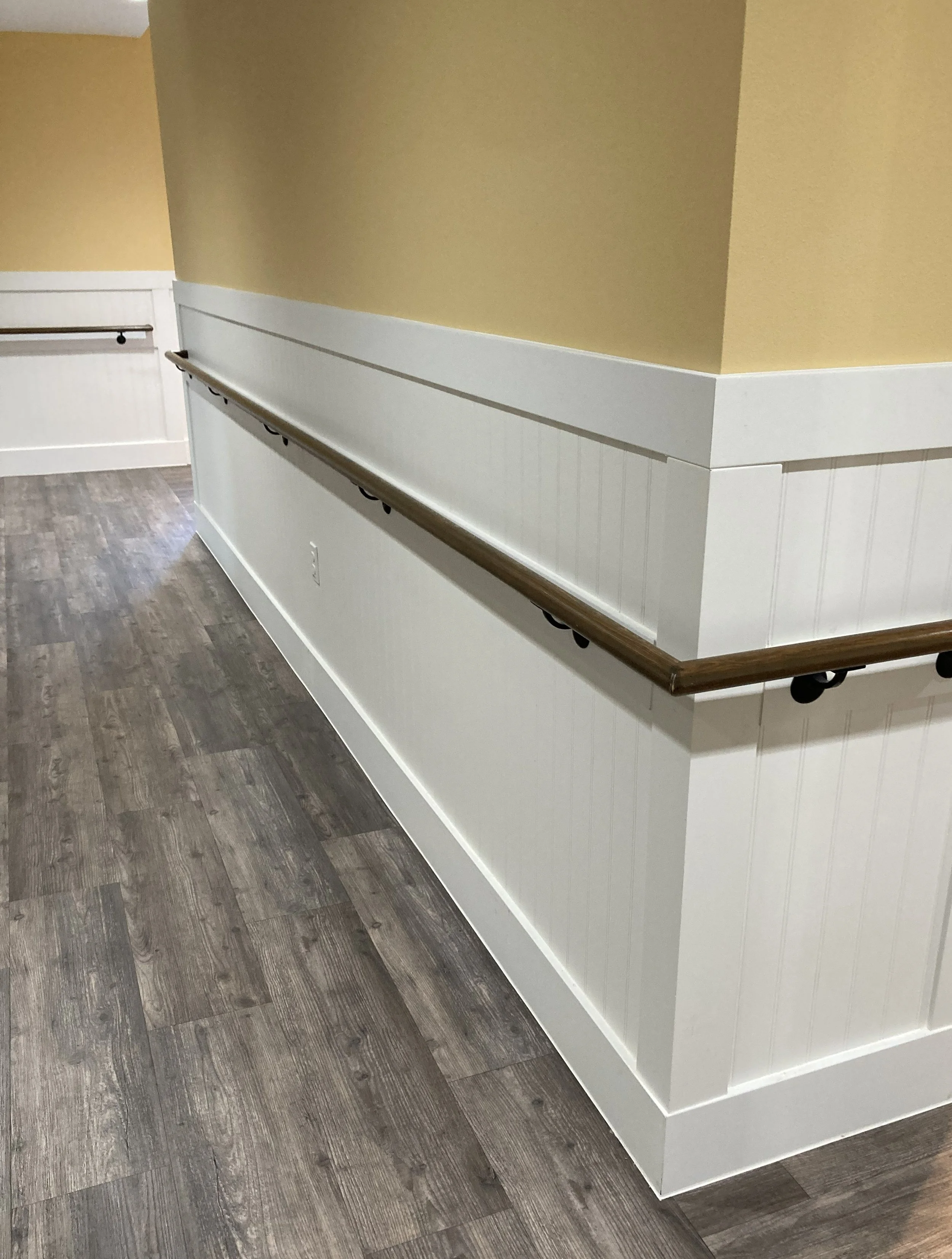
Good example of strong contrast between floor and wall, as well as the dark handrail against the white wall. Image source: Author
Simple improvements include choosing wall colors that contrast with flooring and selecting flooring that differs from adjacent surfaces. Baseboards can help mark the edge, but they should generally be similar to the wall rather than highly contrasting. Strongly contrasting baseboards in long hallways can create a tunnel-like effect, which may be disorienting for older adults.
Bathrooms
Bathrooms are consistently identified as the highest-risk location for falls. Moisture, reflective surfaces, hard finishes, and tight layouts all contribute. When bathroom fixtures, floors, and walls share similar tones, visibility decreases and risk increases. A toilet that is easy to see can cue adults with dementia and support continence. Clear contrast helps make bathrooms easier and safer to use.
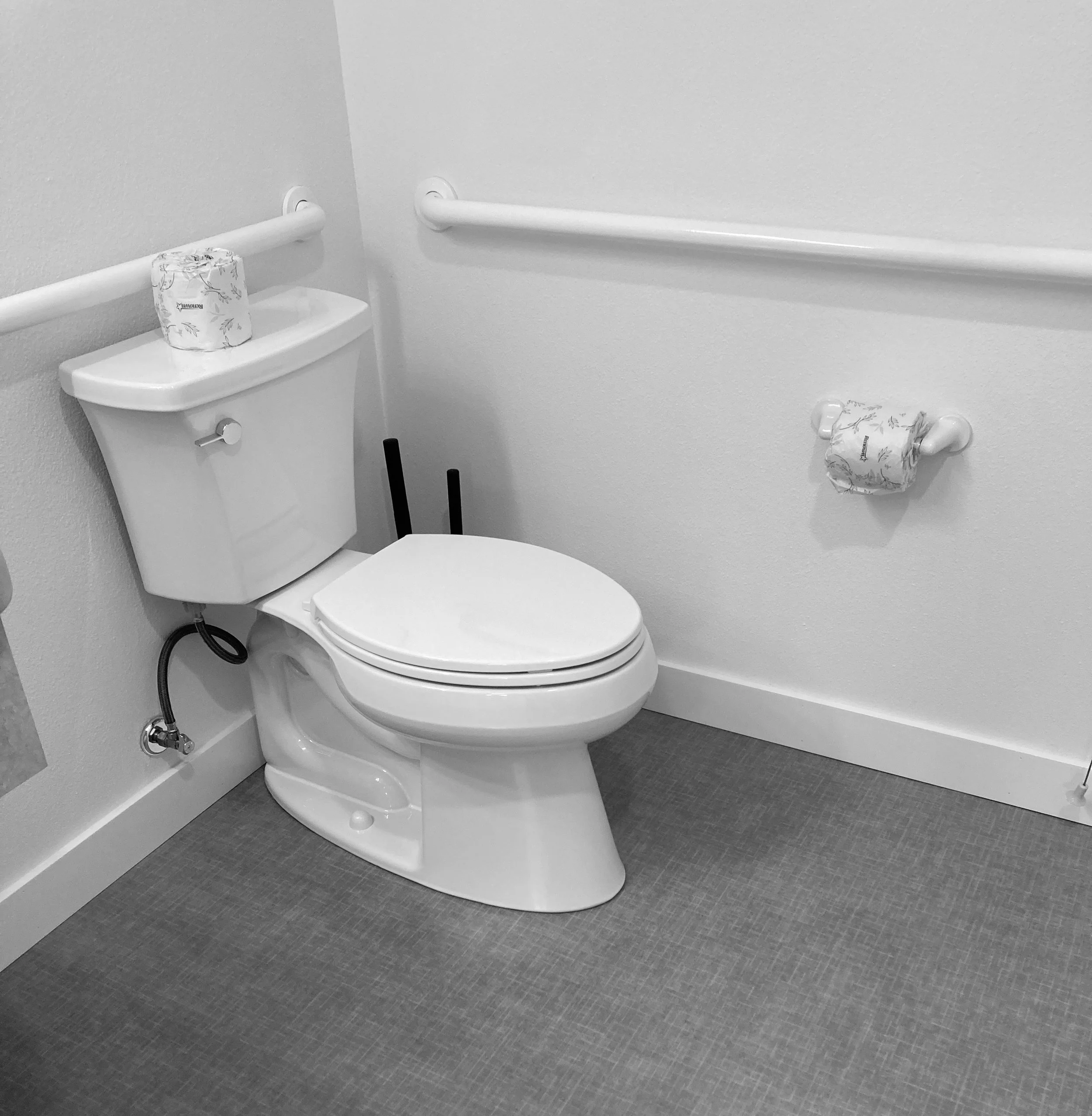
Although the floor contrasts well with the wall and toilet, the toilet, grab bars, and toilet paper blend into the wall, reducing visibility and making the space harder to interpret.
Helpful strategies include:
selecting a toilet that contrasts with the wall and the floor
choosing a toilet seat that contrasts with the bowl is a simple fix
installing grab bars that contrast with the wall color
selecting sinks and countertops that differ in tone
choosing shower seats and rails that contrast with surrounding tile
These changes are simple and inexpensive but offer meaningful safety benefits.
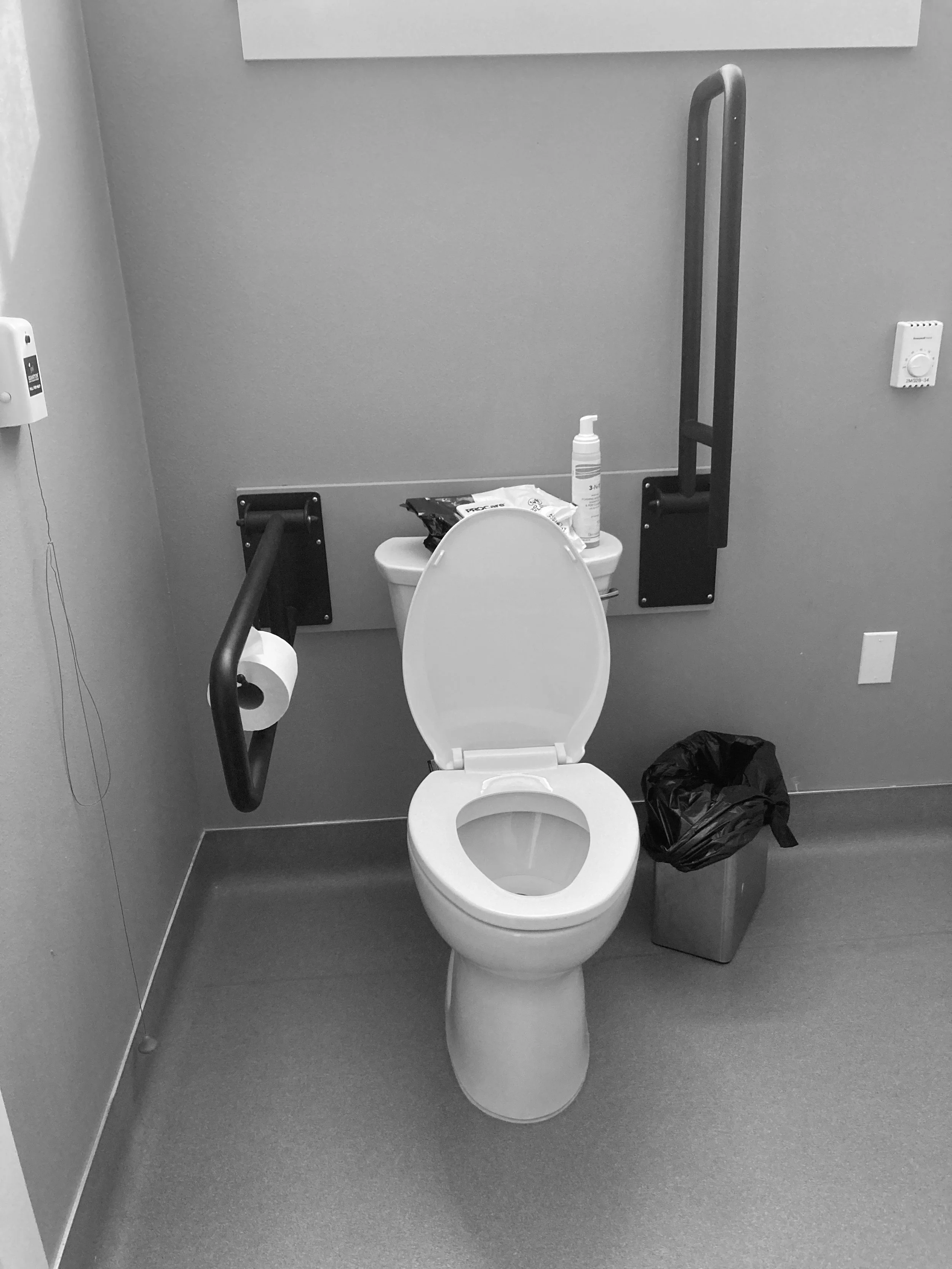
This bathroom uses strong contrast between the toilet, floor, and walls, and the grab bars contrast well with the wall. However, the coved base at the floor-to-wall transition makes it difficult to see where floor ends and wall begins. Image source: Author
Furniture
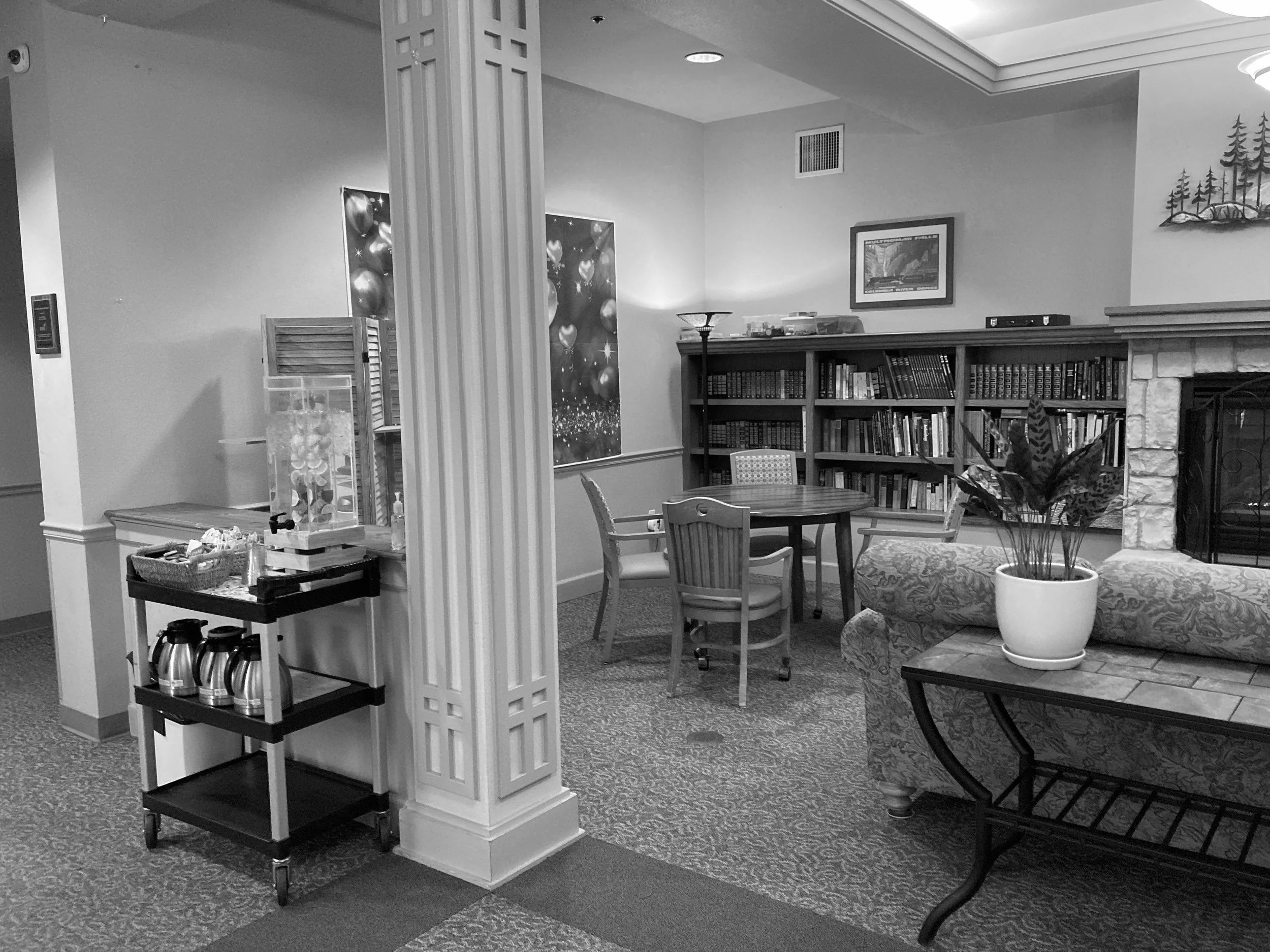
The sofa is almost indistinguishable from the patterned carpet, and the chairs offer little contrast with the floor. For older adults or anyone with low vision, these conditions make it harder to judge where the furniture begins and may lead to missteps or falls. Image source: Author
As depth perception and contrast sensitivity decline, older adults rely more on clear visual differences to locate chairs, tables, and other furnishings. When upholstery blends into the floor or tabletops blend into the room, it becomes harder to judge edges or see where to sit or place objects. These visual challenges can reduce confidence and increase fall risk.
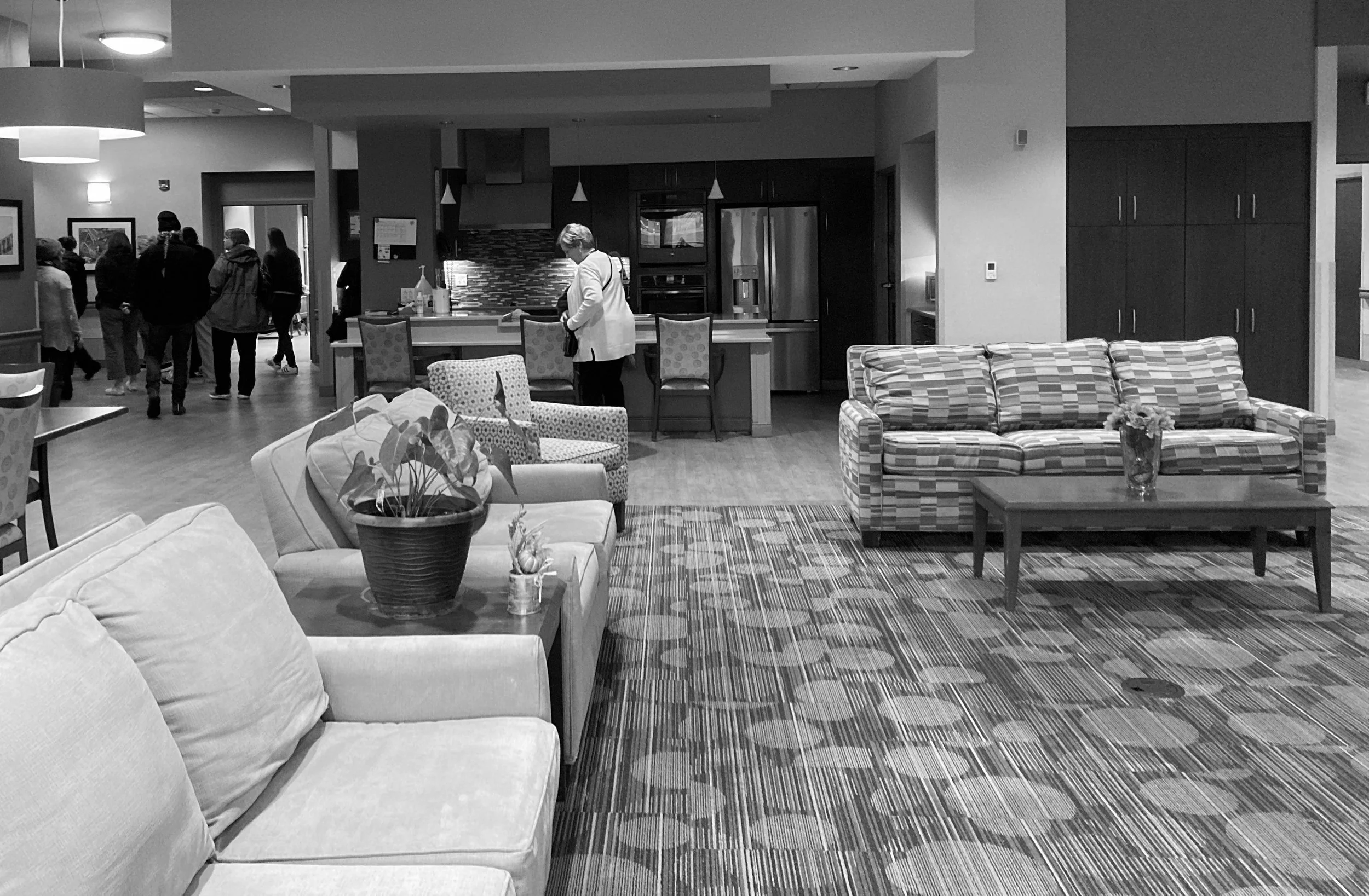
The lighter sofa is easy to distinguish, but the patterned sofa competes with the carpet design and becomes difficult to see. The strong pattern on the floor can interfere with depth perception and may even be perceived as holes, uneven surfaces, or barriers. For older adults or anyone with low vision, this can diminish confident gait and make it harder to move safely through the space. Image source: Author
Design strategies that help include:
using upholstery that contrasts with flooring and walls
choosing tabletops that contrast with the floor
avoiding patterned carpets that visually compete with furniture
These adjustments help reduce visual confusion and support safer movement.
Stair edges and changes in level
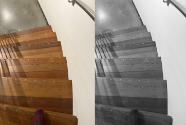
These wooden stairs are visually appealing, but the lack of contrast makes the tread edges nearly impossible to distinguish. Shadows further blur the boundaries and weaken depth perception cues. In the grayscale version of the image, the problem becomes even clearer. The steps blend together, and even the shoe is barely visible, showing how little contrast is available for anyone with reduced contrast sensitivity or depth perception changes. Image source: Author
Depth perception is challenged when stair treads blend together, making it difficult to judge where each step begins and ends. A contrasting strip at the front edge of every tread improves visibility and reduces hesitation. Marking the first and last steps with even stronger contrast helps people anticipate the change in level.
Contrast is also helpful wherever there are small changes in level that can cause trips, including:
slight rises at door thresholds
small ramps or beveled transitions
raised patios or decks
landscape edges along outdoor paths
Clear visual cues on stairs and level changes support safer movement and greater confidence.
Other areas where contrast helps
Contrast also supports independence and ease of use in:
handrails on walls
doors and door frames
signage and artwork
light switches and outlet covers
cabinet hardware and drawer pulls
placemats and plates
edges of exterior walking paths
appliance handles and oven controls
Each of these relies on visual recognition, which becomes easier when surfaces are clearly distinguished.
Where we do not want contrast
On level flooring, high contrast between adjacent surfaces can create the illusion of depth changes. For older adults with reduced contrast sensitivity or altered depth perception, a strong line or pattern on the floor may look like a step, hole, or change in height.
The bold striping pattern creates the illusion of changes in level, and the wider dark stripe may be perceived as a step or hole. The vertical surfaces are easier to interpret, with good visual separation between the walls and doors, and between the walls and floor. Clear door visibility supports safer and more confident navigation. Image source: KFF Health News
To avoid confusion:
keep contrast low between adjacent flooring sections
avoid sharp pattern transitions
use continuous, low-variation flooring in hallways
minimize decorative borders or floor inlays
avoid high-contrast rugs or mats
Continuous flooring with low contrast reduces misinterpretation and supports confident walking.
Where we use low contrast intentionally
There are also situations where reducing contrast is helpful. In some environments, especially senior living and memory care, it can be safer to make certain doors and door frames less visually prominent. Lower contrast can discourage entry into areas that are not intended for residents, such as:
staff-only rooms
mechanical or electrical rooms
storage areas
kitchens or service areas
stairwells or unsafe outdoor exits

The door and door frame are painted to match the wall, which helps reduce its visibility. Extending the baseboard color across the lower edge of the door would complete the disguise. This approach is often used for doors leading to staff-only or restricted areas.
By using door and frame colors that are similar to the surrounding wall, these locations become less visually salient. This helps prevent confusion, reduces wandering, and guides people toward the doors and pathways meant for everyday use. At the same time, it is important that all essential exits remain clearly visible and code compliant.
Using low contrast strategically can protect residents while still supporting autonomy and safe navigation.
How to Measure Contrast Using LRV or a Simple 10-Point Grayscale
Design guidance often recommends high contrast, but this becomes more useful when you can measure it. Two easy methods work well in both homes and senior living communities: Light Reflectance Value (LRV) and a simple 10-point grayscale. Both measure how light or dark a surface appears, which directly affects how older adults perceive edges and boundaries.
1. Light Reflectance Value (LRV)
LRV ranges from 0 to 100, where 0 is pure black and 100 is pure white. Manufacturers list the LRV for many finishes.
The Dementia Services Development Centre (DSDC) recommends a minimum 30-point difference in LRV between key surfaces to ensure they are visually distinct. This applies to:
floors and wall
doors and walls
handrails and their background
bathroom fixtures and surrounding surfaces
How to check LRV contrast:
Look up the LRV of each surface.
Subtract the two numbers.
If the difference is 30 or greater, the surfaces will usually be visually distinct for older adults.
Example:
Wall LRV 72
Floor LRV 25
Difference = 47
2. A Simple 10-Point Grayscale
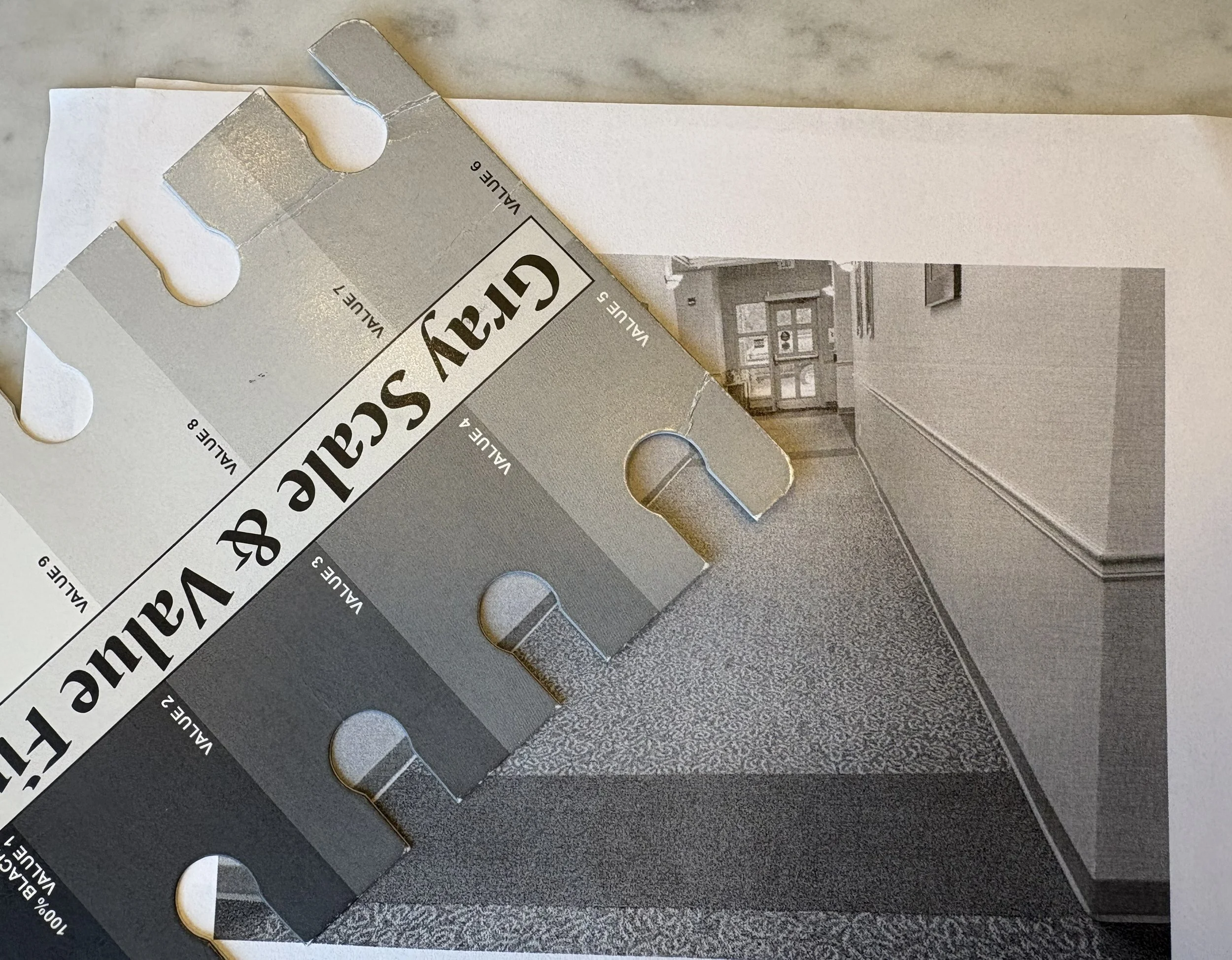
Printing images in black and white makes it easier to use a grayscale value finder. Line up the color inside the keyholes to determine the closest match. In this example, the baseboard reads as a 3 and the wall as a 5 or 6. The main areas of the carpet fall around a 4 or 5, which means there is very little contrast between the wall and the floor. Ideally, the baseboard should be closer in value to the wall than to the carpet to create a clearer boundary.
When LRVs are unknown, a 10-step grayscale is a practical tool.
0 = darkest
10 = lightest
How to use it:
Take a photo of the surfaces.
Print the photo in black and white.
Match each surface to a step on the grayscale.
Subtract the two values.
A 3-point difference roughly corresponds to the DSDC minimum of 30 LRV points. Larger differences create clearer visual separation in low light or complex environments.
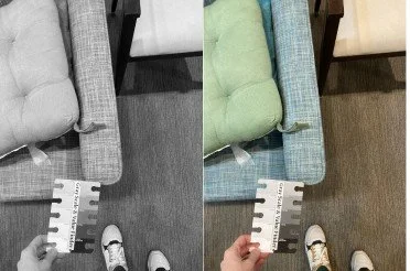
The side-by-side images show how easy it is to miss low contrast in color. The grayscale version reveals only about a three-point difference between the chair and floor, which is the minimum level of contrast and can still be very hard for older adults or anyone with low vision to distinguish. Image by author.
References
American Academy of Ophthalmology. 20 Ways Aging Changes Your Eyes. 2023. https://www.aao.org/eye-health/tips-prevention/20-ways-aging-changes-your-eyes
Mehta J, Czanner G, Harding S, Newsham D, Robinson J. Visual risk factors for falls in older adults. BMC Geriatrics. 2022;22:134.
Valipoor S, Pati D, Kazem-Zadeh M, Mihandoust S, Mohammadigorji S. Falls in Older Adults: A Systematic Review of Literature on Interior-Scale Elements of the Built Environment. 2020.
Woodbridge R et al. Use of the physical environment to support everyday activities for people with dementia. 2016.
Dementia Services Development Centre (DSDC), University of Stirling. Dementia Design Toolkit: Light Reflectance Values (LRVs). https://dementia.stir.ac.uk/newsblog/dementia-design-toolkit-lrvs